 View on GitHub
 Customization guide Reference
Customization guide
The Gini Pay Business SDK components can be customized either through the GiniPayBusinessConfiguration, the Localizable.string file or through the assets. Here you can find a complete guide with the reference to every customizable item.
Supporting dark mode
Some background and text colors use the GiniColor type with which you can set colors for dark and light modes. The text colors should also be set in contrast to the background colors.
Generic components
1. Gini Capture font
Payment Review screen
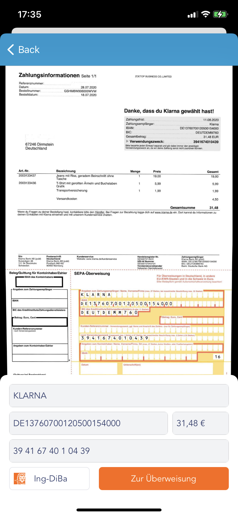
1. Background color
- Background color →
GiniPayBusinessConfiguration.paymentScreenBackgroundColorusingGiniColorwith dark mode and light mode colors
2. Input fields container
- Background color →
GiniPayBusinessConfiguration.inputFieldsContainerBackgroundColorusingGiniColorwith dark mode and light mode colors
3. Input field
- Background color →
GiniPayBusinessConfiguration.paymentInputFieldBackgroundColorusingGiniColorwith dark mode and light mode colors - Text color →
GiniPayBusinessConfiguration.paymentInputFieldTextColorusingGiniColorwith dark mode and light mode colors - Font →
GiniPayBusinessConfiguration.paymentInputFieldFont - Corner radius →
GiniPayBusinessConfiguration.paymentInputFieldCornerRadius - Border width →
GiniPayBusinessConfiguration.paymentInputFieldBorderWidth
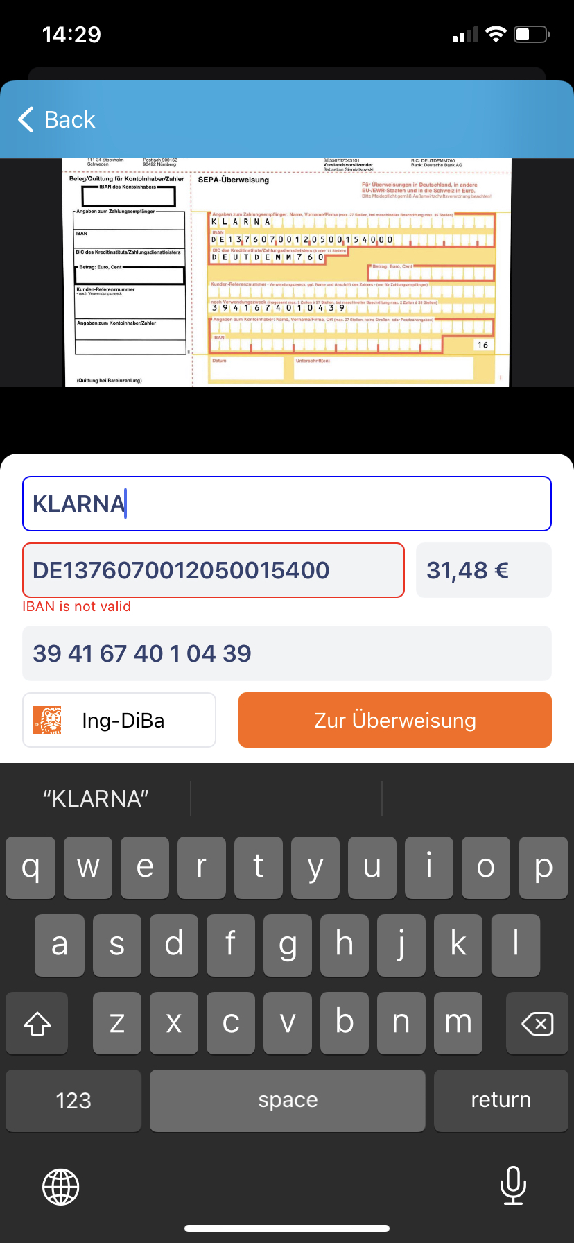
- Error selection style border color and error label text color →
GiniPayBusinessConfiguration.paymentInputFieldErrorStyleColorusingUIColor - Focus selection style border color →
GiniPayBusinessConfiguration.paymentInputFieldSelectionStyleColorusingUIColor - Focus selection style background color →
GiniPayBusinessConfiguration.paymentInputFieldSelectionBackgroundColorusingUIColor - Placeholder text color →
GiniPayBusinessConfiguration.paymentInputFieldPlaceholderTextColorusingGiniColorwith dark mode and light mode colors - Placeholder font →
GiniPayBusinessConfiguration.paymentInputFieldPlaceholderFont - Recipient placeholder text → ginipaybusiness.reviewscreen.recipient.placeholder localized string
- IBAN placeholder text → ginipaybusiness.reviewscreen.iban.placeholder localized string
- Amount placeholder text → ginipaybusiness.reviewscreen.amount.placeholder localized string
Purpose placeholder text → ginipaybusiness.reviewscreen.usage.placeholder localized string
Recipient error label text → ginipaybusiness.errors.failed.recipient.non.empty.check localized string
IBAN error label text → ginipaybusiness.errors.failed.iban.non.empty.check localized string
IBAN validation error label text → ginipaybusiness.errors.failed.iban.validation.check localized string
Amount error label text → ginipaybusiness.errors.failed.amount.non.empty.check localized string
Purpose error label text → ginipaybusiness.errors.failed.purpose.non.empty.check localized string
Default validation error label text → ginipaybusiness.errors.failed.default.textfield.validation.check localized string
Amount placeholder text → ginipaybusiness.reviewscreen.amount.placeholder localized string
Purpose placeholder text → ginipaybusiness.reviewscreen.usage.placeholder localized string
4. Pay button
- Background color →
GiniPayBusinessConfiguration.payButtonBackgroundColorusingGiniColorwith dark mode and light mode colors - Text color →
GiniPayBusinessConfiguration.payButtonTextColorusingGiniColorwith dark mode and light mode colors - Font →
GiniPayBusinessConfiguration.payButtonTextFont - Corner radius →
GiniPayBusinessConfiguration.payButtonCornerRadius
5. Loading indicator
- Color →
GiniPayBusinessConfiguration.loadingIndicatorColorusingGiniColorwith dark mode and light mode colors - Indicator Style →
GiniPayBusinessConfiguration.loadingIndicatorStyleusingUIActivityIndicatorView.Style - Scale factor →
GiniPayBusinessConfiguration.loadingIndicatorScale